
The move by House of Fraser to redesign its websites around responsive design and with a ‘touch screen first’ approach so as to tap into the more mobile centric shopping habits that are rapidly emerging puts the company at the vanguard of online retailing. For we are witnessing a real shift in how people interact with the web – and, to quote the legend that is Vic Reeves, “we really wanna see those fingers”.
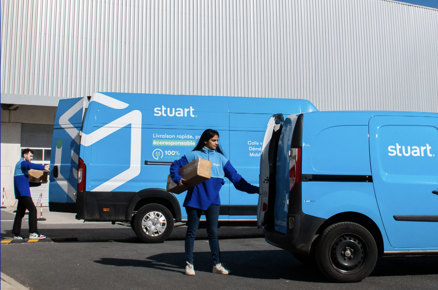
The proliferation of tablets as a mass-market device is reshaping what e-commerce means for retailers and this impact is being – or, for many, is going to be – keenly felt in their web design and IT departments. Because we are approaching a point where web access is going to be a matter of taps not clicks and of swipes not mice. Yes, happy shoppers are becoming tappy shoppers as they start to replace their clunky – and very 90s – desktop PCs and laptops with tablets, smartphones and ‘phablets’. A fact that has not gone unnoticed by House of Fraser.
In fact House of Fraser has made, I think, a startling decision. Seeing half of its traffic come from mobile devices is one thing; to equate this – quite correctly – with a shift towards how consumers are using different devices to do their shopping from home is quite another, inspired, leap. They should be applauded – and emulation is just around the corner.
But what does this really mean in practice for retailers? Well, the shift is pretty seismic. In many cases what this means is a complete redesign of the e-commerce website from the backend technology and coding on which it is built, right through to the design philosophy that is employed to make it look good, Heck, it even means changes to colours, fonts and point size. This is major.
Not since the introduction of broadband has web site design been so shifted. Designing for the touch screen world means a drastic rethink, but in having to also accommodate not just a variety of devices, but also the old school PC means that new designs have to function on several levels.
For instance, gone are the below the fold days – we now have a generation of shoppers who scroll: the fold is irrelevant. Gone too are the days of Flash and even cookies (don’t worry you can you DNS) as these don’t tend to work on most tablets and smartphones. Gone is the need for crowded, flashing websites, Gone too are the opportunities for banner advertising. In short websites are about to be transformed.
Retailers need to be looking at single columns, carousels, better images, better links, bigger buttons, and to make more use not just of the screen, but also of the other technologies innate to a phone or tablet: motion sensors, microphones, cameras and sounds. All these things will be liberated to make websites much richer and much more functional.
House of Fraser has made the first, bold, step towards this brave new website world. Which of you is next and how far are you going to go?
Sarah Baillie, head of multichannel business development at House of Fraser, will speak at IRX 2014. Her retail case study, Driving profit through refocusing your stores strategy around the multichannel customer will be in the Internet Retailing In-Store Conference at 11.10am on Wednesday March 26. For more information about the Expo, visit internetretailingexpo.com.