
Mobile is no longer a trend, or even just an opportunity; it is quickly becoming the new standard for consuming content. David Bowen, Product Manager at EPiServer reports on the extent of consumer appetite for mobile commerce and what shoppers really want from the experience.
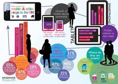
In December 2012, Ofcom announced that smartphone penetration in the UK market had hit 58%, with 19% of consumers now tablet owners. In addition to this, an average of over £1,000 per person is spent online every year; a figure that is being “increasingly driven” by the use of mobile devices, according to Ofcom. Against this backdrop of an increasingly mobile internet and an app-based economy, EPiServer [IRDX VEPS] recently conducted a survey to find out the extent of consumer appetite for mobile commerce and what they really want from the experience.
Our findings backed up Ofcom’s figures, revealing high use of the web on smartphones and tablets. Mobile websites proved to be marginally more popular than apps, with 63% accessing websites on their smartphone daily compared to 60% respectively. When we look at actual purchases via mobile, websites are most popular, with a total of 51% completing purchases on a website via their mobile on a regular basis, versus 40% via apps.
However, it appears that the mobile internet is not quite as mobile as we may assume. As much as marketers talk about targeting consumers ‘on the go’ via mobile, by far the most popular place for people to use their smartphones to access websites is in fact at home, cited by 63% of smartphone users. This was followed by usage on public transport and in the office. This trend is compounded on tablet devices, with 80% saying that ‘at home’ was where they used their device to access websites the most.
CONSUMER EXPECTATIONS OF THE MOBILE WEB
Regardless of location, it seems increasingly clear that mobile devices are now the first port of call for consumers when accessing the web and shopping online. This in turn brings challenges for marketers and ecommerce specialists. The EPiServer study has revealed that the mobile experience is far from perfect and retailers are failing to live up to consumer expectations of receiving all the functionality they are used to on desktop.
Over half of mobile shoppers said they often experience problems when shopping via mobile. The biggest bugbear continues to be speed, but a significant number (42%) responded that mobile sites are typically missing the functionality they expect on a desktop site, at 42%.
Our research also highlighted that 2013’s mobile-savvy consumers are increasingly less forgiving of a poor mobile experience. With 54% of users leaving the site when they run into difficulty, and over a quarter trying a competitor, retailers risk losing significant business by not meeting consumer expectations.
BENCHMARKING UK RETAILERS
Having identified the expectations and frustrations of UK smartphone and tablet users, we benchmarked 30 of the UK’s top online retailers from the IMRG Hitwise Hotshops list to see how well they are performing against these.
Our research indicates that retailers are working hard to meet rising consumer expectations as mobile becomes an increasingly important part of their digital marketing mix, with an encouraging average score of 55%.
A positive observation was the number of retailers offering an optimised mobile site experience, revealing the increasing focus on developing mobile sites over apps only. In a similar study we carried out in 2011, 30% of the top 10 retailers didn’t have mobile sites, but now this is the case for only 17% of the top 30.
A great example of a retailer maximising its mobile offering is Debenhams [IRDX RDEB], which toppled Argos off the top spot this year with a very impressive 90% score. Debenhams performed well across the board of mobile offerings, but excelled on its app strategy.
The Debenhams iPad app is impressive, scoring an unbeatable 100%. Easy to navigate, it delivers a superior shopping experience as well as a good store finder function. What particularly stood out was the effort to incorporate Debenhams’ store magazine into the app, giving users an engaging browsing experience and more in-depth content when they need it.
We saw some outstanding mobile sites too, particularly Your M&S, which had the best performing website and a very well designed HTML5 experience. One of the most impressive aspects of the site is how quickly it loads despite being relatively image heavy – something that the results of our consumer study show to be very important.
Whether it’s for casual browsing, searching for particular products or just looking up the nearest high street branch, the site delivers, and delivers quickly.
THREE WAYS TO IMPROVE YOUR MOBILE OFFERING
With these customer insights and real-world examples in mind here are three practical tips to improve your mobile offering:
- Mobile site first There is no right or wrong answers in the continued debate of mobile site versus apps. The platform you choose depends on many factors including your sector, customer preference and sales volume. However, our research does indicate that on the whole, consumers use mobile sites more than apps and are in fact more likely to make purchases via mobile sites. So it’s not a bad idea to start with an optimised mobile site and get the basics right before jumping on the app wagon. Responsive design used effectively can provide a great mobile experience across different screen sizes and gives you the opportunity to learn how your customers are engaging with you on mobile prior to further investment.
- Contextualise your content on devices Usage in the home is even more pronounced on tablets than smartphones: 80% of respondents in our study said they use their tablet devices most in the home. This indicates more than simply grabbing a device to check some information quickly. People are using their mobile devices to browse leisurely too. Take the opportunity to offer them more engaging content by incorporating social networking, video or editorial to make your site or app more sticky. By incorporating the store magazine, Debenhams’ iPad app provides users with just the right engaging browsing experience and in-depth content to keep them on the site.
- Connect the online/offline experience Not having the functionality of a desktop site is one of the biggest frustrations consumers experience with mobile sites. Don’t let screen size limit you in terms of functions and features, and apply the knowledge you have about user behaviour on desktop to mobile. Instead of desktops, customers are using mobile sites and apps to find your store and check stock lists before they visit, so make it easy for them. Whether at home or on-the-go, mobile is now the first port of call and should be used wisely to drive footfall to retailers’ physical stores, trigger purchases on the spot and assist in after-sales care. Asos is a good example, as it includes a map function within its iPhone and iPad apps to find the nearest location to take products for returns.
The good news for retailers is that implementing many of these tips is relatively simple, and it could pay dividends considering the popularity of m-commerce and the huge online consumer spend. Looking into 2013, retailers must deliver the right mobile experience as consumer expectation continues to grow.