Web effectiveness score 20/25
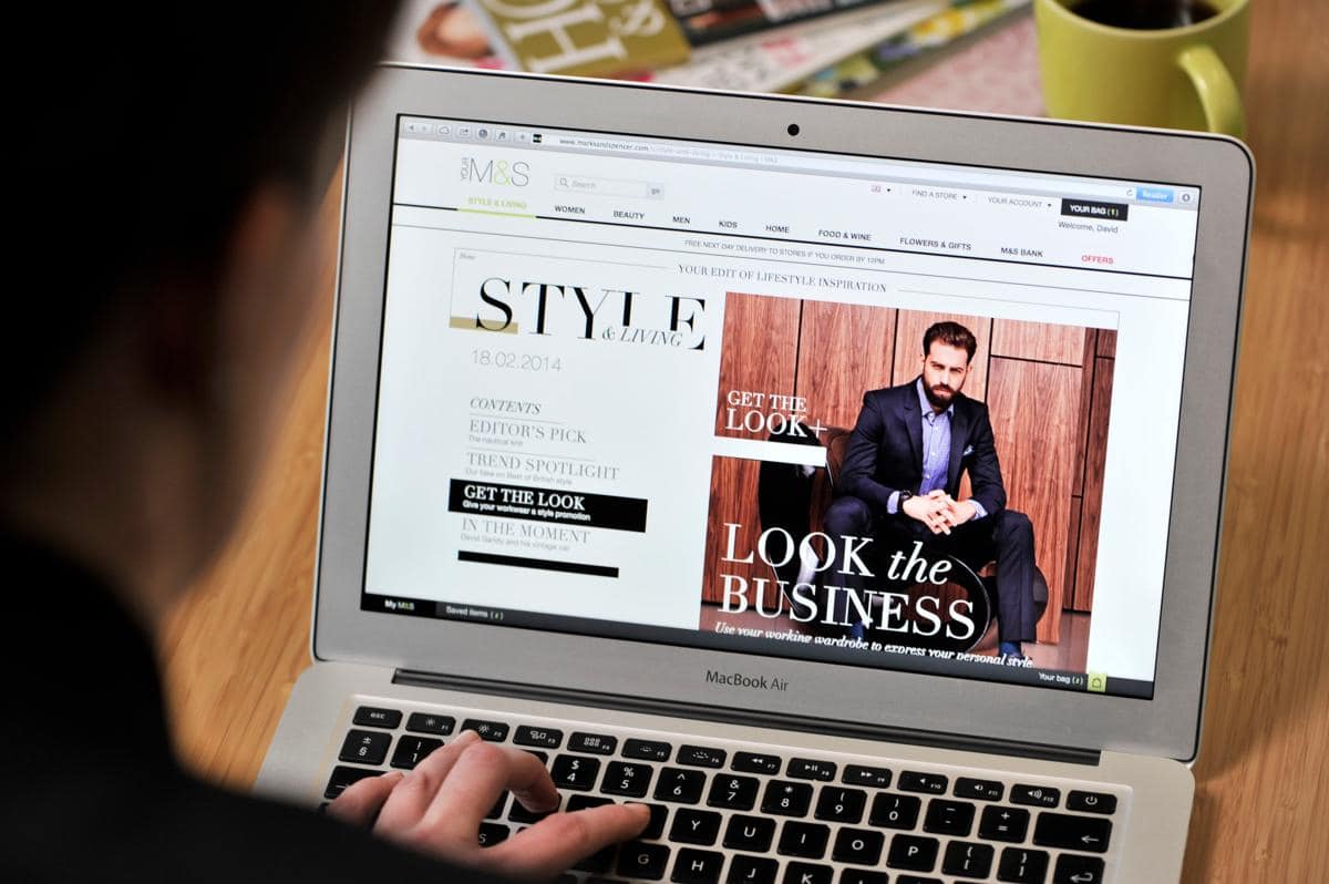
Marks and Spencer’s have recently launched their new website with the aim of inspiring customers through lifestyle related content and imagery.
Home
As a user wanting to purchase an outfit for an occasion, the homepage successfully delivers inspiration through positive imagery and clear call-to-actions. The carousel offers dynamic content which is seamlessly linked to the new Style and Living section. This section presents category and subcategory content, proving to be an inspirational starting point for all user types. However, navigation through the articles found below the carousel should flow more intuitively. If the user fails to see the scroll bar, they are restricted to viewing only the front facing content. The carousel technique should be reinforced here, displaying the content via a familiar interaction.
Home > Search >
With a vast range of content on offer, it is essential that the site is able to cater for varying browsing behaviours.
Developments around this have involved presenting a more structured navigation pane through merging the primary content headers. The “lingerie” header now sits as a subcategory under “women” and “school uniform” sitting under “kids”. This should follow user expectation more accurately, allowing for a cleaner layout and simple product location.
Greater flexibility around product search has been employed throughout the site. Users are now able to use multiple avenues to search for their product, for example a party dress may be under “highlights – party wear”, under ‘Dresses’ or under the ‘search box’ now placed next to the brand logo. In addition, a faceted navigation pane on the category page now has an added check box next to the product specification, generating a more visually interactive section, speeding up result delivery.
Specifications of available product sizes have also progressed allowing users the option to select long, petit, regular or standard ranges. Refinement of these search parameters in such a detailed manner ensures users are returned more accurate results quicker. Overall these faceted search filters deal admirably with displaying a large number of options to users in a manner that is easy for them to understand and utilise via scanning behaviours.
Home > Search >Category Page
The category page makes good use of whitespace to display the garments. The roll-over product display is a nice addition in automatically presenting how the item would look when worn. A range of product images are essential in allowing users to realistically visualize the product and build trust into what they are buying. This is heightened with the additional product images presented on the product page.
Home > Search >Product Display> Buy
The product page elegantly directs the user through the buying process with the use of a responsive green arrow guide. This will counteract any likelihood of users ‘missing-a-step’ or overlooking a specification input. Clarity on stock numbers is also provided through a live status, urging users to ‘get it before it is gone’, a good persuasion technique in encouraging an instant purchase.
Good alignment is reinforced within the ‘my basket’ page aiding readability and aiding scanning behaviours. However the ‘price total’ and ‘remove’ feature shown at this stage should be added to the ‘basket pop-up’ notification, helping users tailor their purchase prior to the checkout stages.
Conclusions
On a whole Marks and Spencer is a prime example of an effective ecommerce site. The revised structure effectively follows user expectation with good use of navigation titles and calls to action throughout. The product page in particular successfully guides the user through the experience while setting an exemplary balance between contextual images and product information. In addition the style and editorial section offers diverse, fresh content that will inspire and engage a range of user types both regular and new. Slight issues were identified in how this information was displayed to the user as well as the basket summary pop-over, yet in general this is a leading retail site.
Navigation and IA – 4/5
Persuasion and Trust – 5 /5
Product Page & Merchandising – 4/5
Checkout / Bookings – 3/5
Accessibility – 4/5
Overall – 20/25