BHS were subject to a great deal of scrutiny as they went into administration and shuttered their physical store locations – only to reopen shortly afterwards as a web-based retailer. Is the new BHS website usable enough to retain this company’s loyal – but aging – customer base, or appealing enough to draw in a new demographic?
First impressions
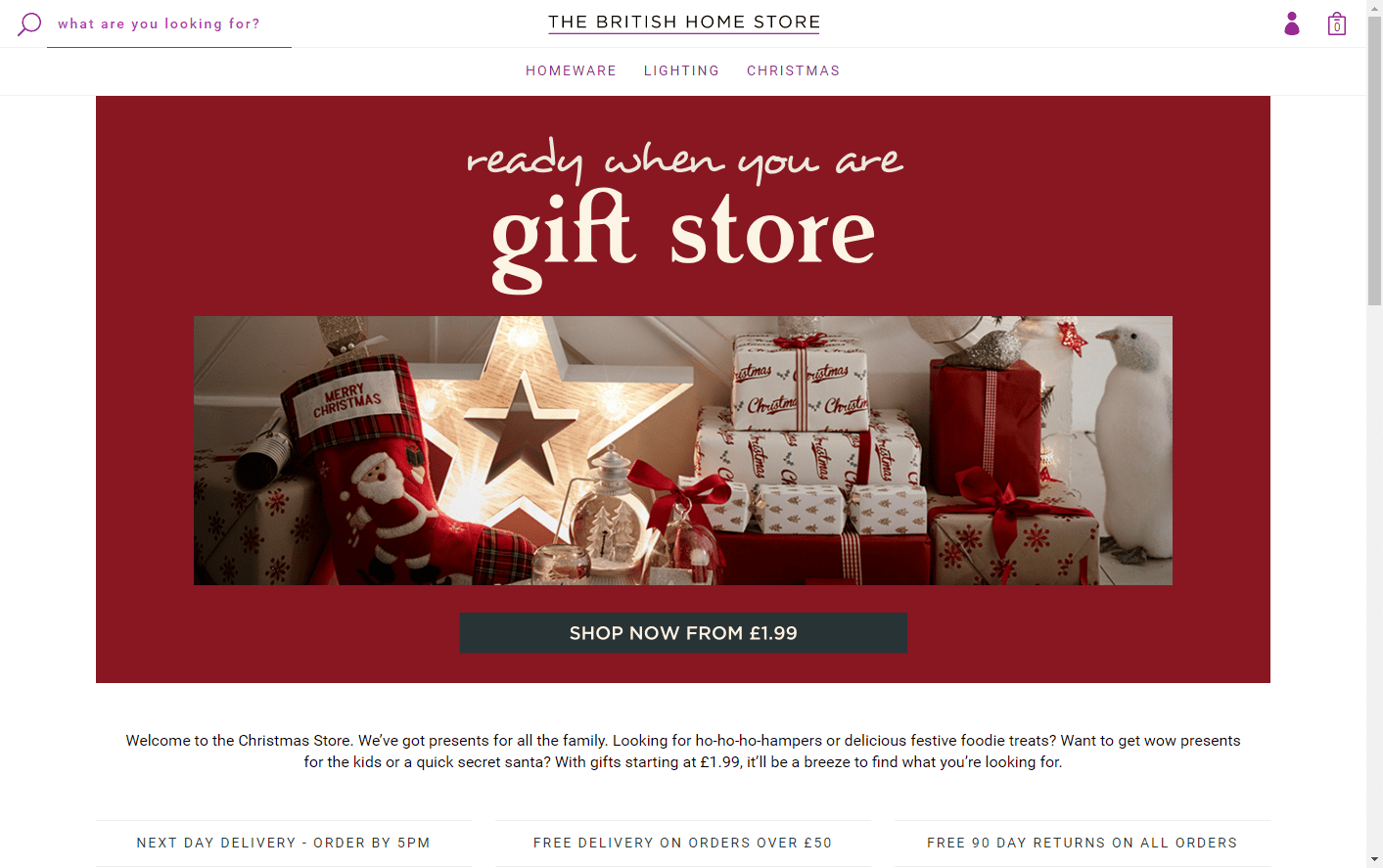
The BHS home page is sparse, with only three top level navigation options and little text on the page. However, with a large red hero image and call to action directing visitors to ‘shop now from £1.99’, the focus of this site seems to be on securing a bargain.
Clicking this CTA brings up a full 5 pages of gift options, with few options for filtering and sorting. I am not sure where to begin, and look to the filter options at the left.
Navigation
There is no clear information architecture within the Christmas gift section in particular. The flat navigation of the site and unclear categorisation make it difficult for users to drill down to the products they need.
Faceted navigation options allow users to narrow down the products shown, but the choices on this page are very broad and seem to overlap considerably. Some simply repeat the options presented in the mega menu, and many focus on audience (e.g., ‘gifts for her’) rather than functionality.
While it is helpful to allow customers to look for items using terminology that is familiar to them, having separate ‘candles & home fragrance’ and ‘home fragrance & candles’ options is confusing. While one might assume that these options bring up identical sets of items, the default sorting (by relevance) differs. It is not clear why the items pictured on the first page of results differ, or whether it is necessary to look at both sets of results to see all of the candles available for purchase on the site. If customers do not trust the results they see on the site, they will be less likely to make purchases.
Search
The prominent search bar at the upper left offers a direct route into the full range of product offerings. This tool offers predictive search functionality, bringing up suggested categories of items as well as specific items that match the search term entered.
Some of the suggested categories that come up under search are more intuitive than others. For example, I clicked ‘charcoal’ expecting to find barbecue supplies – but instead reached a page of grey towels and rugs. ‘Charlotte’ leads to a page containing a single ceramic hen. While some customers may want to search for idiosyncratic or very specific items, the predictive results should prioritise the largest categories and most commonly searched terms.
Product pages
The product pages are cleanly presented, but many do not provide enough information to allow customers to make an informed decision. They seem aimed at users who are already familiar with BHS’ offerings, without providing any copy or imagery meant to inspire new customers. Each product page has only a single image, missing opportunities to showcase items from different angles to give customers a better idea of what they have to offer.
For example, on the page for the ‘Charlotte ceramic hen’, this item designed for egg storage is only shown from the outside, and it is not clear from the description or even the dimensions given how many eggs it can hold. The copy contains some grammatical errors, which can reduce consumer confidence and trust in the website. Additional items in the range are mentioned, but not linked in the description or available via the dropdown menu, which means that opportunities for comparison or cross-selling are lost.
A search for towels reveals that each size and colour of towel has its own product page, making it very difficult to compare options or make multiple purchases within a range. Customers looking to easily purchase multiple sets of towels in different colours might well go elsewhere.
In order to boost conversions, online retailers need to work to overcome any reluctance shoppers might have to order items that they cannot view in person. Retailers such as John Lewis and Marks and Spencer offer website visitors multiple product images, detailed descriptions, customer reviews, and links to recommended/related items, all designed to increase users’ confidence that they are ordering the right item for them. BHS do not currently offer any of these reassurances to customers, instead relying too heavily on existing knowledge of their product ranges.
Checkout
When I proceed to checkout, I see that I have the option to continue as a guest. Offering this option has been shown to increase conversions, and is certainly appreciated here.
The checkout process is very smooth. The required information is not onerous, optional fields are clearly indicated, and an address lookup by postcode feature saves me the trouble of having to figure out how to format my address for this site. Once customers have found the items they wish to purchase, BHS offer a streamlined route to checkout.
Accessibility
Attention has clearly been paid to making this website accessible for users with disabilities, but some improvements could be made to make the site more fully inclusive. A notable positive is that on the checkout page, labels are correctly associated with form fields, which means that disabled users who rely on assistive technologies will be able to fill in their details. Error messages are clear and descriptive, but there is no help text for fields like ‘card verification code’. In addition, the checkout process times out without warning after a few minutes, bouncing users back to the start.
Disabled users should have a relatively easy time purchasing items, but they might struggle to find them. Tabbing through the site brings up ‘skip to main content’ and ‘skip to navigation’ links, but these links do not become visible on focus – which means that screen reader users will be aware of them, but sighted keyboard users will not. The top level navigation is keyboard accessible, but the subcategories in the mega menu are not, making it more difficult to drill down to relevant results.
Ratings
Navigation and IA – 3/5
Persuasion and Trust – 3/5
Product Page & Merchandising – 2/5
Checkout / Bookings – 5/5
Accessibility – 3/5
Overall – 16/25
Bio
Jessica Cameron is a User Experience Consultant with User Vision in Edinburgh, where she has worked on a wide variety of projects involving eCommerce, travel and tourism, and entertainment. Prior to joining User Vision, she was responsible for user testing around the launch of the City of Edinburgh Council’s digital first strategy and responsive website.
Jessica has a PhD in Social Psychology from Stanford University, and likes to use a variety of research techniques to investigate how people understand information and make decisions.