… long live the tablet site. With more consumers shopping from tablets, is it time to redesign
websites to be tablet friendly and treat the PC as secondary, wonders Paul Skeldon?
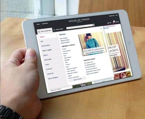
House of Fraser has redesigned its website. Not a sentence that would usually stir much in the hearts of e-comm professionals, but the announcement in early February is groundbreaking. The retailer has not just tidied up its logo and shifted some elementsof its site about; it has totally rethought how its users use the site in this era of touch screens and tablets and this puts House of Fraser at the vanguard of ecommerce.
The retailer is getting more than 50% of its ecommerce traffic from mobile devices. More tellingly from touch screen mobile devices – and so it has opted to design its site with touch screens and simple navigation up front.
That goes for how the ‘traditional’ PC version works as well.
The move by House of Fraser comes as no surprise – and it certainly isn’t going to be the last retailer we hear of in the coming months to have done this. The times they are a-changing.
2013 was the worst year yet for sales of ‘traditional’ PCs: according to IDC’s Worldwide Quarterly PC tracker, sales of PCs slumped globally by 10% compared to 2012.
It looks like the big grey box era is at an end. Of course, the demise of the PC has been hastened by the rise of the mobile device, most notably the tablet, which is slowly but surely starting to become the instrument of choice for those shopping from home.
Gone are the days when ‘mobile’ commerce meant something different to PC-based ecommerce. While smartphone users are using their mobile devices while on the move to shop – and throwing up countless challenges an opportunities as a result – the rise of the tablet, largely at the expense of the PC, is having a profound effect on how retailers design their websites.
Or rather it should be having such an effect, but it isn’t. “It is becoming very clear as to how consumers are choosing to shop, and that’s laid back on their sofas, tablet in hands,” says Adam Levene, SVP, Strategy, at Monitis Create. “Last year represented the worst ever drop in sales of PCs. In the same time period, tablet sales grew by over 50%. The rise of the tablet has fundamentally changed how customers shop online and retailers must embrace the change.
TOP TIPS FOR REDESIGNING YOUR SITE – AND FUTURE PROOFING IT
The rise in tablet use and the importance of servicing tablet-based customers is going to become business critical in the coming year as tablets slowly become the home computer device of choice.
While it looks and feels like a very costly undertaking to redesign and even rebuild your whole site consider how not only do you need to meet the needs of tablet users in the next two years, but also how within five years, consumers are going to be hitting your site from PCs, phones, tablets, TVs, games consoles, Google Glass, smart watches, kiosks, smart fridges and possibly a whole host of other devices that stand poised to be connected to the web.
So here are some tips when looking at where to take your site next.
- Go touch friendly – Make your site designed around touch, scrolling, flicking andpushing. Try and forget clicking. Make sure buttons and other controls are fingersized and think about embedded keyboards.
- Don’t be Flashy – don’t use flash in your sites. Apple products don’t support it andincreasingly neither do many other ‘mobile’ OSs. Look also at what other soft and middleware is unsupported.
- Ignore the fold – With so many people now familiar with scrolling on tablets and smartphones, the ‘below the fold’ ethos of web design is debunked. People are used to flicking a finger and scrolling, so design accordingly.
- Tangled up in type – type size and font is crucial. You don’t want it to be too small(too much zooming in) and you don’t want it to be too big (too much scrolling).There is no simple rule of thumb on this, you are just going to have to experiment with point sizes, fonts, line length and leading (space between lines) until you think it works.
- Declutter – don’t have the site totally cluttered up with elements and stuff. Think clean and functional and rely instead on good navigation to get people to all the things you want to show them rather than cram it all on the home screen.
- Delink – similarly to the cluttering issue, start to look at how to facilitate great navigation without resorting to loads of links. The fewer links the better.
- Make it social – have an eye to how to make it easy to share socially.
- Great content – above all make the content on it count. Mobile/tablet sites require less content, so make sure what you are putting on it is fantastic, compelling and short.
- Go responsive – make sure that what you are building on offers responsive design so that you have some flexibility in the years to come when new devices start to become points of retail too.
- Think like consumers – you have to really get into how consumers think and what they do around your various online presences and design accordingly.
- Test, test, test – above all, whatever you do, keep testing it, keep asking people about it and keep tweaking it. People’s tastes change and adapt so keep pace with this. Your site should be a living, breathing thing regardless of devices that access it and it is never ‘finished’.
DON’T GET LEFT BEHIND
However, while consumers are opting increasingly for the more tactile, responsive and visually driven devices, retailers are still very slow to accommodate them. This is increasingly facing retailers with a problem: give it two years and they will be offering up PC-centric websites to an audience that is, in the main, on tablets.
“There is very much an attitude of ‘it ain’t broke, so don’t fix it’ with retailers at the moment and many are ignoring the significance of tablets,” warns Carin Van Vuuren, CMO at Usablenet. “Consumers see tablets as an ‘everyman’ device and they are increasingly incorporating them into their sales journey, often now to actually purchase. Smartphones are typically used for research, but the buying is increasingly taking place on tablets. The desktop device is coming in third and is viewed more and more as a bit clunky.”
Retailers should sit up and listen. 77% of consumers who don’t get a great experience from an ecommerce site are unlikely to visit that site again, according to independent research carried out for Usablenet last year.
A further 67% are unlikely to tell anyone about your site or recommend it if they have had a below par experience: and this now is something that tablet users are seeing.
Retailers ignore tablet shoppers and the shift to tablets at their peril. According to eMarketer’s Bill Fisher “Tablet users have the greater presence among digital buyers. Having a tablet almost guarantees that the person uses it for ecommerce. By 2017, 78% of US tablet users will make purchases via the device.”
So, what can be done? Well, retailers need to take a very good look at where their site visitors are coming from device-wise, what they are doing and where, when and why they are leaving. Think about how they are experiencing the site across different devices and if needs be ask some of them what they do and don’t like.
Above all, think about how consumers use tablets, suggests Levene. “The tactile nature of tablets requires the interface to be easier to navigate, starting with how the customer discovers and browses products. Designing for tablet provides an opportunity to streamline the checkout experience and make transacting easier.”
THE CHALLENGE
Increasingly, retailers are going to have to face the fact that their site is going to be designed for tablet, but will also work on PC – not the other way around. This presents massive challenges.
“The solution to a world of fragmented devices can be found in responsive design – allowing for the provision of a single website that renders optimally across multiple devices,” says Levene. But, uptake of businesses however has been slow with a recent IAB survey reporting that just 11% of the top 100 advertising spenders in the UK have invested in designing their web presence responsively.
“Apps designed to live on mobile provide retailers with more advanced features to create a richer and more personalised shopping experience; for example making use of data to tailor the interface, and one-tap payment to
enable faster checkout,” he suggests, but again these have their limitations, with discovery chief among them. More prosaically, Usablenet takes a more nuts and bolts approach to the problem as exemplified by the work it has done on the Marks & Spencer site. Better and bigger pictures, carousels, enhanced tactile navigation and the ability to be viewed in different orientations are all traits that are in the M&S site that make it work very well indeed on a tablet.
“In fact, this site is very much one that ‘also works on PC’, with its layout and design elements fundamentally akin to tablet apps,” says Van Vuuren. “This has all come about by thinking like consumers and analyzing how consumers use the web to shop.” House of Fraser meanwhile, has grabbed the bull by the horns and is actively promoting this touch screen first approach.
The homepage and category hub pages have a fresh new look with a quicker load time and more interactive elements designed to maximise the rate of conversion. The product listing pages now feature three shots per row (previously four) which creates more space and allows larger images to be displayed.
Product pages also boast larger images with a new ‘super zoom’ feature which offers customers a clearer view of the product. The shopping bag feature has been improved to make it more concise and easier to edit. All these are key design features of making a ‘mobile’ centric site that also works on PC.
Andy Harding, Executive Director for MultiChannel at House of Fraser , commented: “Consumer shopping habits are constantly evolving and given we now see more than 50% of our online traffic coming from mobile devices, we have changed our design strategy to ensure we provide the best possible experience for our online customers. Wealways looking at ways to maximise customer shopping experiences and we’re confident our new look and feel website will be well received and will help continue to drive growth this year.”
While it is clearly vital to service the growing number of tablet shoppers and indeed to future proof your ecommerce business, don’t lose site of the real driver here, warns Levene. “It’s easy to get caught up with the technology and the challenges of multiple devices. However, when it comes to shopping in the connected age, what’s important and shared across nearly all customer segments is the ability to find the right product fast and transact easily.”