By understanding how customers want to navigate sallyexpress.com, the team behind it has designed its merchandising to work for the people who use the website
CUSTOMER TO THE to the sallyexpress.com website, the UK retail arm of $5bn turnover US hair and beauty supplier Sally Beauty, have a serious interest in the field. These are customers who are looking for professional-quality tools and equipment.
They want to find the products they are looking for quickly – and to be well informed about technical details. In response, the Sally Express team, led by Richard Surridge, Sally Beauty’s head of ecommerce and customer services, UK and ROI, has learned from its customers how they want to navigate the site. That’s happened partly through anonymised analytics and through A/B testing, and partly through telephone interviews and studies using eye-tracking technology Crazy Egg.
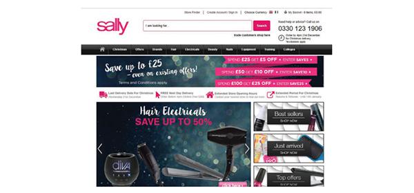
“From the eye tracking that we did, we found that no one was clicking on the promotional banners but heading for the sub-category navigation,” says Surridge. “We redesigned the page with that in mind.” Analytical tools, including Google Analytics, Optimizely, and Treejack, were used to test hypotheses about what customers wanted to see over the course of their website journeys, with the results then being implemented.
One such test was around the use of the failed search page. (A key metric in the InternetRetailing research is around whether ‘no results’ searches come back with a blank page, or with other suggestions, reflecting the importance of offering alternatives.) “Originally,” says Surridge, “you’d search for something and it didn’t appear with alternatives but it used to show you the top 20 products or the top offers. I found that a bit odd when I joined. If someone did that in a shop and said, ‘I’m after this particular product,’ and the sales assistant said, ‘We don’t stock that but how about this completely random product,’ it wouldn’t work.
“I think sometimes in ecommerce we don’t necessarily think about how customers would behave in a store. We designed a different page, and I think it was a 45% increase in revenue that came out of that page.” The new page encourages shoppers to take a different approach to the search, looking by brand or category, or rethinking the search altogether.
Working in partnership
Many of these customer-focused approaches to analysis, he says, were first put in by digital consultancy Good Growth, when it started the job of developing the ecommerce function. Now these approaches have become habit. “It’s nice to see my team now using that on an ongoing basis on everything they do,” says Surridge. He adds: “It is using that kind of customer insight, not being shy to game customers’ ideas, and make sure that we’re not overly confident that we know what we’re doing – you can have all the best experience in the world but customers do some strange things every now and then.”
InternetRetailing research found that Sally, which operates local currency sites both in the UK and in Eire, stood out for highly relevant use of autosuggest product search, while navigational filters enabled customers to drill down by price, brand and product type. Ratings and reviews are clearly visible from the product page, and social media plug-ins including enable shoppers to share finds.
Surridge says it’s been important to be driven by the data rather than the idea of making the site look attractive. “I haven’t really touched the home page in terms of design,” he says. “We found that maybe only 25% of customers go to the home page, so that would have been a vanity project and wouldn’t necessarily have driven any sales. Most people are diving into category and navigation pages. We’re focusing on where we can really make a difference.”
That has also meant focusing on areas such as product information – technical details and quality are important for the hairdressers and interested amateurs that buy from the site. It’s also meant making the checkout pages simpler, and removing distractions. Previously, says Surridge, there were too many different pages that shoppers could visit from the checkout page. Now, the site has been redesigned so that purchasers move through the checkout as quickly as possible to complete the sale. In addition, the number of checkout pages involved was reduced from two to one. “We did that from an analytical point of view,” says Surridge, “asking where is the opportunity to increase conversion rate, to reduce dropouts, and other individual steps – then we continually tested those pages. That worked quite well for us.”
“I think sometimes in ecommerce we don’t necessarily think about how customers would behave in a store.” Richard Surridge, Sally
Site relaunch
There are more ideas to come once the website relaunches on Demandware – now Salesforce Commerce cloud – next summer.
“There’ll be an opportunity to start building from there,” says Surridge, “with more content pages, creating a better opportunity to shop, and probably introducing a bit more personalisation as well. To a degree on our retail site, we have a database – [it’s about] how we can link that in using something like the Emarsys marketing automation tool, how we can drive levels of content, or some of the email messages and service messages that go out post purchase.”
Surridge thinks the new website will bring important changes, enabling sallyexpress.com to develop further, and with its merchandising honed around what the customer wants and how they want to shop.
“There are opportunities in the next 12 months,” he says, “and hopefully we will see a paradigm shift with new website, with all the things I’ve been wanting to do for last 18 months finally coming to fruition.”